youbloom Redesign
Overview
Youbloom is a global platform that brings fans, show creators, and artists together to deliver live experiences.
Leading the UX/UI Design Team, I redesigned the screens across the website, navigating the challenge of implementing adjustments within a tight timeline.
TEAM
Angela Lui
DURATION
3 Months
Introduction
THE USER
-
Fans: Individuals seeking to attend live events featuring smaller, niche, or emerging artists
-
Artists: Performers aiming to connect with their fanbase, often with limited resources and support
-
Show Creators: Organizers or producers who host events in collaboration with artists
THE PRODUCT
-
Global music platform connecting fans, artists, and show creators.
-
Focused on smaller, niche, and emerging artists rather than mainstream acts
-
Provides tools and support for artists and show creators to promote events
-
Hosts live shows that bring local communities together
HOW MIGHT WE...
Business Goal
Redesign youbloom’s website to boost conversion and engagement by streamlining navigation, modernizing the interface, and developing a UI kit that allows the brand to stand out against competitors
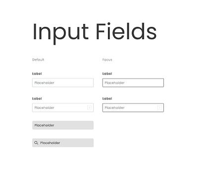
CREATING THE DESIGN SYSTEM
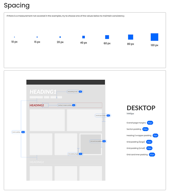
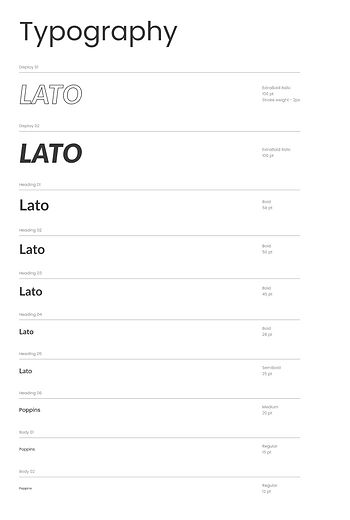
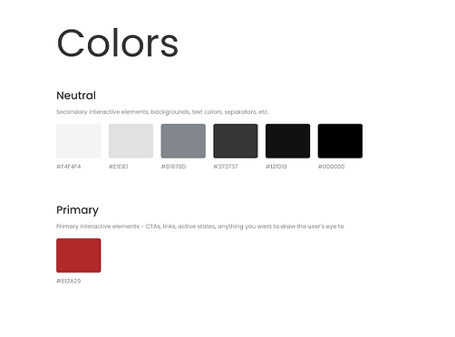
One of the major challenges in redesigning the website was addressing the inconsistencies across the existing interface. The site used a mix of different fonts, font sizes, colors, and spacing, which made the experience feel disjointed. To solve this, we first created a new design system to establish consistent visual standards, ensuring uniformity across all screens before moving into the design phase.

Browsing & Viewing Shows
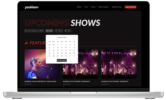
Browsing Shows
One of the most important features of the website was allowing users to view and sign up for upcoming shows on the Shows page. This was a core function, as retaining users and supporting artists and show creators depended on making it easy to browse concerts and purchase tickets.
The previous Shows page lacked energy and excitement, and the interface felt outdated and uninspired. Our goal was to redesign this experience to be more engaging, intuitive, and visually appealing, encouraging users to explore and take action.
Prioritized key info like performer, location, date, and price, and applied typography to reflect the intended visual hierarchy
Introduced a playful hover interaction where a recording-style red circle appears when hovering over a show card, reinforcing the theme of live entertainment

Added intuitive filter system featuring a calendar-style date picker for easier date selection, along with a location field that offers smart suggestions as users type
Added a "Featured Shows" row to align with competitor offerings and highlight high-priority events, with goal of boosting visibility and driving ticket sales
Viewing Show Page
Added Similar Events feature aimed to increase ticket sales
Chunk information into different sections to make it more digestible
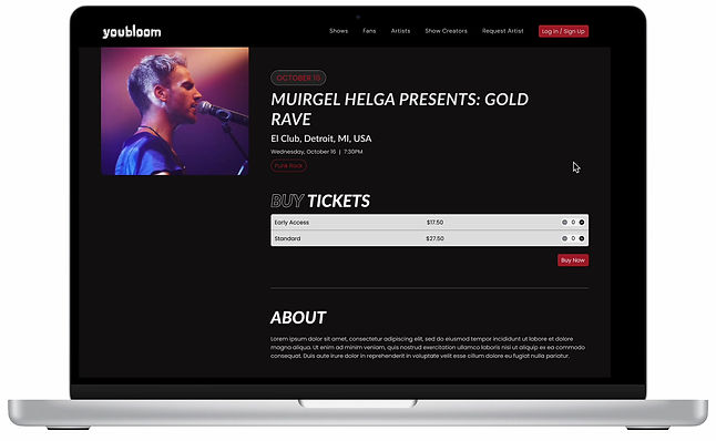
Created a sticky constraint for the event cover photo, allowing it to scroll alongside key event information. This added a sense of movement to the page and kept the visual context anchored throughout the browsing experience
Artist Profile
Current Screen
In order to have users feel connected to artists, and therefore want to attend their concerts and support them, we needed to make sure artists had a pleasent interface to show their information on. The current one felt flat and uninspired.

Too uniform-- While consistency is good, layout with same spacing, font size, and color makes page feel monotonous
Lack of hierarchy--Every element looks equally important so users don’t know where to focus
OLD LAYOUT
Implemented Design

OPTION 1

OPTION 2

OPTION 3
Artist name is large and prominent, with a clear cover image setting the tone
Styled social media icons in a neutral color to minimize visual distraction and maintain focus on primary content

Request button is bold and obvious, encouraging immediate engagement
Verified button is visual but secondary to other information to reduce clutter
Ticket Buying Experience
Current Screen
It was clear the ticket buying section was outdated, and did not align with our new design system.

ORIGINAL SCREEN
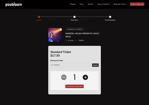
Enhancements
Added event image to bring visual excitement and reinforce what the user is purchasing
Adjusted font sizes to distinguish key content
Used background colors to segment sections
Placed crucial ticket information inside lighter boxes to naturally draw the eye
Moved the layout to the center of the screen instead of full-width, creating a more focused, balanced experience
Include event location and time to keep essential information visible throughout the process
Introduced a progress bar to help users understand their place in the checkout flow.

OPTION 1
OPTION 2
Implemented Design
Technical and timeline constraints required us to stay closer to the original layout, we introduced visual refinements to modernize the interface and improve clarity.
Rounded corners and increased contrast with background for improved aesthetics and visual clarity
Styled discount code as secondary field to minimuze visual prominence and keep user focus on ticket selection

Moved the delete ticket action to the right side to align with industry standards and improve discoverability
Isolated red styling to the 'Proceed to Checkout' button to guide users toward the primary action
Quick Note on Collaborating with Developer
To ensure our design was accurately implemented on the live site, we maintained a highly iterative and collaborative process with the developer. We met two to three times per week to review progress and address discrepancies between the coded version and the original design. Since attention to detail was a challenge, I frequently provided specific feedback to highlight where the implementation had deviated from the intended visuals.

EXAMPLE
MOBILE
Current Screens
The youbloom desktop website did not seamlessly convert to mobile and after further evaluation, I realized that simply scaling down the existing desktop components would not lead to a good user experience, even if the elements were correctly scaled.


MOBILE SCREENS BEFORE REDESIGN
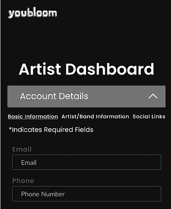
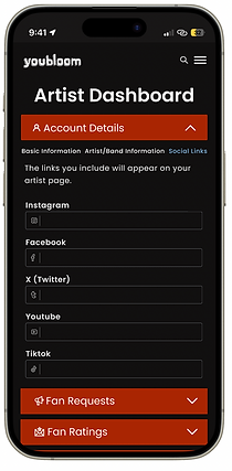
Dashboard Navigation
Users would need to be able to easily access their dashboard in mobile view.

EXISTING DESKTOP VERSION
IDEA 2

IDEA 1
THE CHALLENGE
One challenge I encountered was determining the best way to navigate the different tabs of the dashboard on mobile.
While the team preferred minimal changes, opting for the tab navigation shown in idea 1, the optimal user experience would have been achieved with the dropdown design, as shown in idea 2.
COMPROMISING
After collaborating with developers, we decided to implement the tab navigation as a short-term solution, with plans to adopt the dropdown design for a more refined, long-term user experience.
Selecting From Multiple Options

THE CHALLENGE
One of the main issues I faced was the difficulty users had selecting multiple options on our existing mobile dashboard, as the design was not easily clickable when converted to mobile.
SOLUTION
To resolve this, I designed dropdowns that allowed for easier selection of multiple options, ensuring a smooth interaction even during the button-click process. I created a reusable component for this in Figma to streamline the design process and ensure consistency across the dashboard.
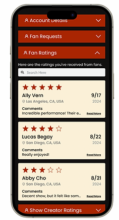
Navigating Multiple tabs within a Dropped Down Tab
CHALLENGE
Another challenge I tackled was organizing multiple sections within a single dropdown menu. Since this was a mobile website rather than an app, I couldn’t assign each general section its own tab. Instead, I needed to brainstorm a solution that would allow users to navigate several sub-sections within a limited mobile interface.
SOLUTION
After careful consideration, I developed a design that provided smooth navigation between tabs, optimizing the user experience without overcrowding the interface.
Lo-Fi Design
Below is the LoFi Design I created, along with the reusable components and beginnings of a style guide.


Hi-Fi Design
Below is the HiFi Design I created.


Reflection
With limited resources, I designed the experience without user testing—relying instead on competitor analysis and team input to guide decisions. While this isn’t the traditional approach, it allowed me to adapt to the company’s workflow and still deliver a thoughtful, user-centered design.
One of the biggest challenges was working under tight development deadlines. This pushed me to prioritize the highest-impact improvements and move quickly from concept to final design, honing my ability to design effectively under pressure.