
Pioneering transformative user research for the Ann Arbor Public Library, uncovering valuable insights on users' experiences
Overview
We conducted user research to understand why many readers do not use local libraries, aiming to identify and address pain points in the library book-checkout process.
User Research Team
Megan Quigley, Cameron Thompson
Duration
3 Months
Problem Discovery
Borrowing a book from the library should be a straightforward process, but in today's digital era, many individuals now prefer the 2-4 month waiting period for books to become available on the Libby app, rather than taking advantage of the resources offered by their local library. As an avid reader myself, I greatly appreciate how libraries make the joy of reading accessible to everyone. I wanted to find out why so many fellow students, who share my passion for reading, opt to wait for digital books on Libby rather than enjoying the resources our libraries provide by uncovering the pain points in the library book-checkout process.
Contextual Inquiry
We conduct 7 contextual inquiry interviews at the public library, following them on the process of them checking out a book from start to finish. We outlined our interview and how we would interact with the user to get their point of view.
After conducting the interviews, we transcribed our conversations with each of our participants and coded the scripts to process the thoughts and feelings of the users. Below is an example of a coded page from one of my interviews.


Affinity Diagram
Next, we used Miro to create an affinity diagram with over 200 pieces of information to uncover patterns and recognize recurring themes among our participants. To qualify as a pattern in our findings, the conclusions had to be supported by at least 3 participants, and had to have least six sticky notes under the theme.

Insightful Patterns


Key Findings
The most challenging aspect of using a library is finding the specific book the user is looking for due to confusing organization systems.

Users heavily rely on signage when looking for a book, and frequently experience frustration when trying to navigate the library due to inadequate signage and organization

Users would use an online portal to see what items they have checked out, get reminders of their due dates, and access their library card digitally

Users place heavy importance on the aesthetics of a book when browsing

Translating Contextual Inquiry Insights into our Final Design Vision
-
Showcase book covers very clearly to emphasize visual allure
-
A user-friendly search function that allows users to quickly locate books based on title, author, or genre. The app should also offer easy navigation with clear categorization.
-
Provide a digital map of the library's layout within the app. Include clear signage information and color-coded sections for easy book location.
-
Digital library card for user convenience
-
Send push notifications as return reminders when a book is due
-
Allow users to manage their checked-out books and see their checkout history.

Surveying
Designing the Survey
We conducted a 20 question survey amongst 20 people, none of who were included in our contextual inquiry. To ensure we would receive useful insights, we meticulously crafted a list of questions, detailing the rationale behind each query in our planning process.

Data Visualizations
In order to increase understanding of users among stakeholders, we created several visualizations to convey some patterns and insights from our survey participants.


Journey Map
We then synthesized the data from 27 users (contextual inquiry and survey), into a task analysis and journey map. This allowed us to further empathize with users' emotions by mapping and writing their emotions and feelings at each stage. By visually mapping user emotions throughout the journey – from book selection to the checkout process – we were able to identify emotional peaks and valleys, empathizing in areas of ease and potential frustration.

The Most Unhappy Part...
We found that Tasha experienced the most frustration and unhappiness after her book was not where she had expected it to be, when she was trying to troubleshoot. She doubted herself and felt embarrassed to ask for help. By acknowledging this, our design can implement the targeted improvements in the lower row to mitigate future negative experiences while using our design.

Task Analysis
Our task analysis diagram helps to identify ideas as to where we may be able to improve the design each step of the way so that we can see where users may struggle the most, and how those steps are preventing them from accomplishing their goal. We also must step into the user's shoes in order to think about each step of the process so designers and stakeholders will more closely empathize with the user.
Scenario
A library user needs to check out an interesting memoir they found because they want to read it at home. They currently have the book they want in their hand and need to go through the steps to check out the book to take it home with them.

Let's take a closer look...
In our examination of the librarian-assisted checkout process, we identified a key vulnerability that users face — the risk of forgetting their library card. This oversight can lead to users being unable to fulfill their goal of checking out a book. Therefore it is imperative to develop alternative solutions to address this common issue, especially because multiple users in our contextual inquiry had forgotten their card.

The self-checkout option offers users a higher degree of autonomy, aligning with the preference many expressed to minimize social interaction. However, there are additional steps involved with this method, increasing the potential for user errors and requiring more effort for recovery as users would need to find a librarian when faced with difficulties.
In our final design, we would need to make sure users can easily recover from mistakes so they can have freedom while still maintaining control. There would be a learning curve for first-time users, making an intuitive design critical to guide users seamlessly through the process.

Task Analysis
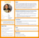
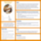
Lastly, we condensed all of our research into 2 user personas.
Reflection
Reflection